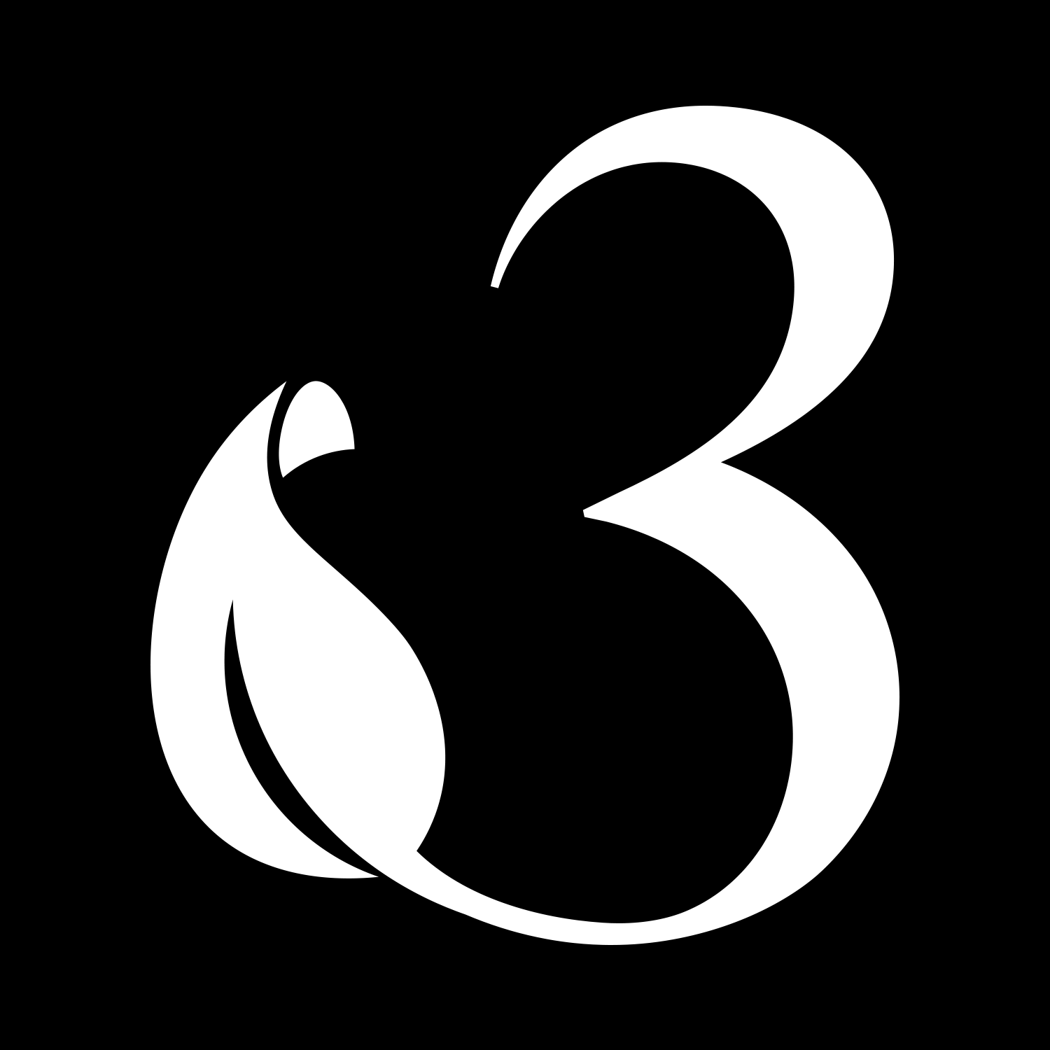
Rebranding is always a challenge, due to sentiment attachment to older brands. The challenge was to add the character “3”, which represents the Arabic Character “ع” in Franco-Arabic texting. It is the first letter in the Arabic text of the brand. It looks like a “3” but is a bit fancy and horizontally flipped. So, we came up with a brand mark that mixes the characters “3” + “ع” + stem (the meaning of the brand) + representation of the business (Plant house).
While working on the brand mark, typography was in mind. We wanted a font that would represent luxury, classic, and elegance. All while maintaining a fresh and dynamic impression. We carefully researched through 200+ relevant fonts and saw that the font “IvyPresto Display” by “Jan Maack” represents our approach perfectly.

The brand’s colors needed to communicate the same values similar to the logo and typography, we also wanted the colors to be vibrant but not too funky to maintain an elegant impression.
Cadmium Green (Primary Color): Vibrant dark green shade representing a plant’s good health. Olive Green (Secondary Color): It complements the primary color with contrast and gives a unique feeling of elegance. Forest Green (Third): Fresh and provides more depth to the brand.